Sunday, 9 December 2012

'Body & Form': Sculpture - Construction

In relation to the other outcomes I finished with by the end of my project brief, the sculpture piece was a rather dragged on process. Perhaps it was partly due to the sense of lacking familiarity with working on clay. However, it was at least as much due to the fact I became more interested in what I was working on in other media (the wire sculptures, Casket and my drawing project).


I remember receiving a comment from my sculpture tutor, describing this to appear very architectural in form. That was most likely a coincidence however, I was after all aiming simply for structural simplicity to focus on the representational aspect of the piece.


Admittedly, I never got around to building any of the figures for the complete piece. However, it seems that the photos taken help show the possibility that the 'tomb' element of Descend to the Earth can work as an art piece on its own. In all honesty, I had lost interesting in trying to work further into this. I'd rather look into other possible materials with which I can create.

Wednesday, 28 November 2012

Body & Form: 'Mythologies' (continued)

Once I found out I could use the photography studios, I took the opportunity to produce better quality images of my wire sculptures.

"If a woman dies in childbirth; either before or after the birth of the child, and before the forty days of uncleaness has expired, she is popularly supposed to become a langsuyar, a flying demon of the nature of the White Lady or banshee. To prevent this a quantity of glass beads are put in the mouth of the corpse, a hen's egg is put under each armpit, and needles are placed in the palms of the hands. It is believed that if this is done, the dead woman cannot become a langsuyar, as she cannot open her mouth to shriek (nglai) or wave her arms as wings, or open and shut her hands to assist her flight."
- 'Journal of the Straits Branch of the Royal Asiatic Society, Singapore (1878-1899)' by Sir William Maxwell

'Langsuir' (2010)
 

"The Vampire of the Phillipines is the Manananggal, a creature that looks like an older but very beautiful woman. Each night, she separates her torso in two at the waist - the word manananggal means 'self-remover' in Tagalog - leaves her lower body behind and flies off on huge, bat-like wings to seek her prey. Her favourite victims are pregnant women sleeping peacefully in their homes. Using her elongated proboscis-like tongue, she sucks out the heart of the foetus or the blood of unsuspecting mother-to-be.
When she flies away, the lower half of a Manananggal is left standing. Several folk remedies can prevent the two halves from reattaching, including sprinkling the lower torso with salt or smearing it with crushed garlic. If the Manananggal cannot rejoin her severed body by daybreak, she will die. Men who have been seduced by the Manananggal stand guard over the lower body to keep it safe for her return."
- 'The Mythical Creatures Bible' by Brenda Rosen


'Manananggal' (2010)

Shortly before taking these photos, I constructed yet another sculpture, this time based on a creature from Japanese folklore. This was called the Dorotabo (or Dorotabou).

 
"A hairless, golem-like mud man with a single eye in the middle of its forehead, it appears spontaneously in rice fields late at night, moaning, crying, and carrying on, generally scaring the hell out of anyone who happens to be in earshot. More often heard than seen, it is a quintessentially rural sort of monster. Although superficially simple, the Dorotabo is actually one of the most metaphoric of the yokai.
According to some tales, it represents the spirit of a hardworking old farmer who toiled to turn a humble plot of land into a productive rice field. In spite of years spent supporting his family and his hopes of providing an asset for his heirs, upon his death his dissolute son turned around and sold the beloved piece of land to pay for women, wine and song.
...Others describe the Dorotabo as the spirit of a farmer cheated out of his land, returned from the grave to haunt its new owners.
Still other theories hold that it is a pun based on the concept of indulging in one's personal vices."
- 'Yokai Attack! The Japanese Monster Survival Guide' by Hiroko Yoda and Matt Alt
 
'Dorotabo' (2010)


Additionally, I made a slight experimentation with another wire sculpture by incorporating mod-roc as part of the structure. Instead of adapting it from a mythological being however, this was based on a transi tomb called Le Transi de René de Chalon made by Ligier Richier.
 

Body & Form: 'Mythologies'

Taking a significant amount of influence from the sculptures of Alberto Giacometti, I set out to construct a few wire sculptures further emphasising the Modular Man. This time, I chose to distort the figures, as if they could still be living in the forms they have taken, however frail they appear. The extent of their bodily distortions were heavily based on the physical descriptions of various mythological creatures. Many creatures if myth possess unusually human qualities, even in form. If not, they are often at least representative of a certain aspect to human nature. Furthermore, the application of the 'utopian' entity was deliberate, tracing its point back to Da Vinci's Vitruvian Man and the mathematically perfect body. With this, I hope to explictly express the notion of perfection with regards to a concept like the human body as something purely arbitrary.


When I was starting this, I considered the possibility of setting up 'genders' between Modulars, since many mythical creatures were often specified as either strictly male or female in form. However, later on, I would take away my focus from this and allow myself to let the identity of the subject's figure become more apparent as it made progress.
Two of the mythical creatures I referenced for this project were from Malay folklore: the Langsuir and Manananggal.


I wanted to be very direct with my construction of the wire sculptures, so I bent the wires into shape with my own hands and rarely used tools, only for when cutting lengths. For reasons I cannot entirely determine, I find a simplistic joy in shaping the wire as I have done. The results were equally pleasing for me.

'Langsuir' (2010)

'Manananggal' (2010)

Saturday, 10 November 2012

'Body & Form': 'Casket'

Considering the memento mori to be a reoccurring theme, I did a little research for a contextual reference:
"'Memento mori', as an artistic theme coincided with the Black Death (circa 1348). Depictions of death and other elements associated with mortality (skulls, hourglasses, snuffed candles, decayed flowers or fruits, etc.) appeared frequently in 'mainstream' art as well as funeral artwork.
A particular form of funeral art that continued until the 18th century was a type of tombstone art known as 'cadaver tombs' or 'transi tombs'. These often featured a two-levelled sculpture; the upper layer shows the deceased as they were when, with a skeletal figure lying below.
Other examples of transi tombs include 'Le Transi de Rene de Chalon' and 'Wakeman Cenotaph'."
With the transi tombs as a major influence, I came up with my own idea for a transi tomb. Similarly stylised after the likes of the Wakeman Cenotaph of Tewkesbury Abbey, I decided to depict my figure(s) in a way that makes them ambiguous from identification.
 
Design for 'Casket' (2010)
 
Originally, I considered this to be a woodwork piece, as I thought of using a door to carve the figures into hence the six panels in the design. However, since I couldn't find the appropriate material for the piece (as I needed a older type of door to carve into correctly), I decided to incorporate the design as a pressed metal peice. Furthermore, this has been produced at a significantly lower scale.
I recreated the outline for Casket with cut lengths of wire and these were to be arranged in as accurate a shape after the design to be then placed under a small sheet of metal and put under a fly-press. I used a fly press before when working on my final outcome for the first project on collections.

'Casket' (2010)
 
In hindsight, it was better for me to have settled for working on Casket, at least for now, at a smaller scale. This metal plate version then works as a maquette of sorts towards the production of the potential full-scale piece.

Sunday, 21 October 2012

'Body & Form': Sculpture - Design

It wasn't until this project brief I made my first major attempt at a sculptural piece that focused on a subject I was strongly interested in. Eventually becoming a recurring theme in some pieces I would explore and create in the future, I focused on the concept of memento mori as a basis in art.

I considered indirectly adapting the overused image of the evolution of man and applying the similar image to the inevitability of death, originally by connecting the depicted figures together in a segmented fashion as one rises from the ground, increases in size and returns to the earth as it once came from. My original sketches for this idea were very much simplified in form and felt all too simple to the point they risked undermining the main idea. Initial visual aesthetics were inspired by the frequently featured figures in works by Keith Haring.

Designs 1 & 2 of sculptural piece
 
Because of my concerns over the form of the piece and a need to enforce the idea, I looked for some potential references that could parallel it. Fortunately, one of my tutors first suggested a figure named the 'Modulor Man', a concpet developed by architect Le Corbusier. The Modulor Man, following a similar premise to Da Vinci's Vitruvian Man, attempted to develop architecture through measurements of the human body (anthropometry) while applying modern mathematics. This brings forth (albeit unintentionally) an utopian quality from Corbusier's figure.
 
Design 3 of sculptural piece

 
"Death needed to occur to the utopian form"


To further emphasise on the allegorical nature of this piece, I looked to Pieter Breugel's Blind Leading the Blind (1568). The time that this painting was made happened to also be within a time period when memento mori artwork was prevalent, Pieter even being a major contributor to such works.
 
Final design for sculptural piece
 
By the time I had produced my final design, I had considered a title for the final piece, 'Descend to the Earth'. I wanted the title to have a similar 'commanding' nature in its wording as memento mori has arguably held as an expression (often translated as "remember to die").

Sunday, 14 October 2012

Fourth Project Brief: 'Body & Form'

Much like any of the other project titles for subject matter, 'the body' is as vague as the next. However, having been determined on my pursuit, now for Fine Art, I decided I should narrow down what areas of interest around the body I could focus on for my outcome(s). Also at this point, I was given the option to narrow down what media (and therefore workshops) I work with. My primary interests lay in sculpture and metal work, especially since they were easily inter-connected in terms of practice. I also settled with painting, due to my personal success with 'Colour & Harmony' as well as animation.

To provide a more definate basis for my project, I developed an idea for a sub-topic around the body to work with. To compliment the exploration of 'Form', the subject I focused on (as I entitled it) was around "Life, Death & Life Within Death". The idea behind this was to look at how life and death encircle one another, certainly throughout a number of cultural perspectives. In other words, I aimed to look at how there is a prevalent belief of living beyond the physically known realms while simaltaneously look at the curious preoccupations people can have over death. The fascination draws on strong spiritual, mythic concepts, something that becomes relevant to my practice and more blatantly so as I continued.

'Colour & Harmony': Conclusion

This project brief was a wondeful opportunity to give me a sense of how I feel about producing work from a more personal frame of mind than, for example, more commercial aspirations. I originally took on the Foundation course with the idea that I would take to illustration. Convinced my ideas contradicted this notion and that I would only restrict my own artistic potential as an illuustrator, my tutor urged me to keep my mind open to the possibility I may wish to take on Fine Art as a subject.

To this day, I am ever grateful he was as insistant on that idea as he was.

'Colour & Harmony', as an experience, forced me to produce work in a more expressive manner and allowed me to realise how much more fulfilling it was for me to produce work purely out of my own interests, something I had clearly been doing already but perhaps took for granted.

I have continued to work around the ideas developed from 'Colour & Harmony' and have continued to take inspiartion from a few artists I discovered around the time I worked on this project, namely Howard Hodgkin, Wolfgang Bloch and Lucio Fontana. Additionally, for future ideas, I have incorporated a more visual approach to my reponses, allowing to make my pieces regarding the music more identifiable with myself and apply influences to my drawing style(s). This includes Corbusier's Modular Man, works of Keith Haring, Jean-Michel Basquiat and even more unusual references originating from various comic-books and styles of online animators. It seems only logical that many of my art pieces, regardless of the intended final media, work as a translation from some form of drawing. Given the very natural and cathartic implications behind my option to produce drawings, it has become something of a primary nature to my art, most likely why it feels most natural for me to 'design' my responses.


'You've Got Another Thing Coming; Judas Priest' (2011)

Tuesday, 9 October 2012

'Colour & Harmony': Painting to Music (continued)

Due to the unfamiliarity of textile design and the divergence of the actual brief animation led to, my main focus for outcomes was in painting. By far, this was also the most productive and cathartic point throughout the project.

To some degree, I even took enough time to 'plan out' how my responses to music would be made. However, some painted responses were still for the most part spontaneous in their form.

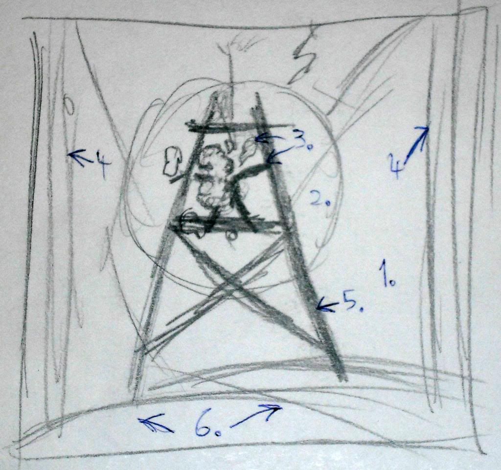
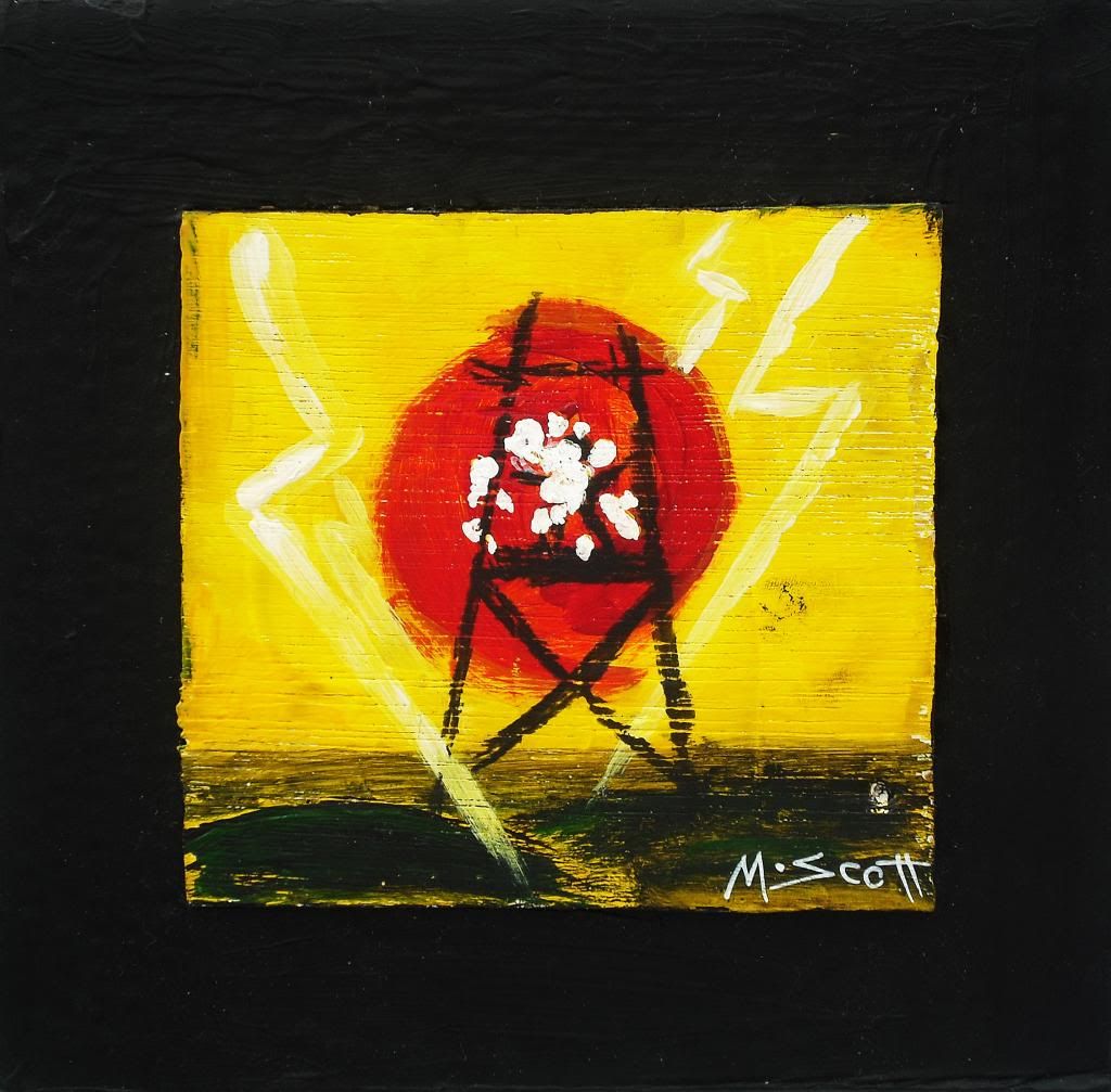
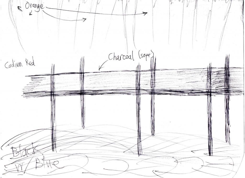
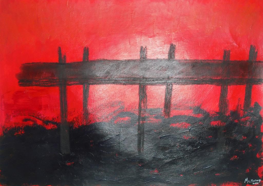
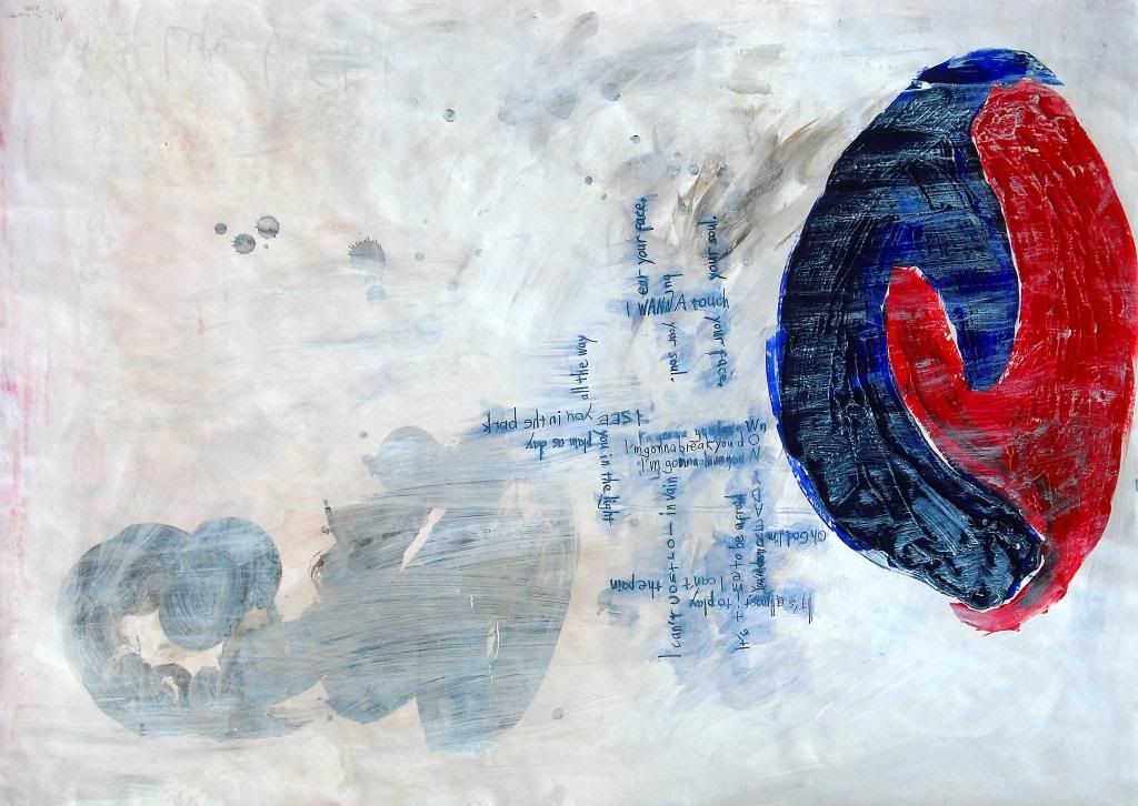
Design of 'Hellions on Parade; CKY'
 
'Hellions on Parade; CKY' (2010)
 
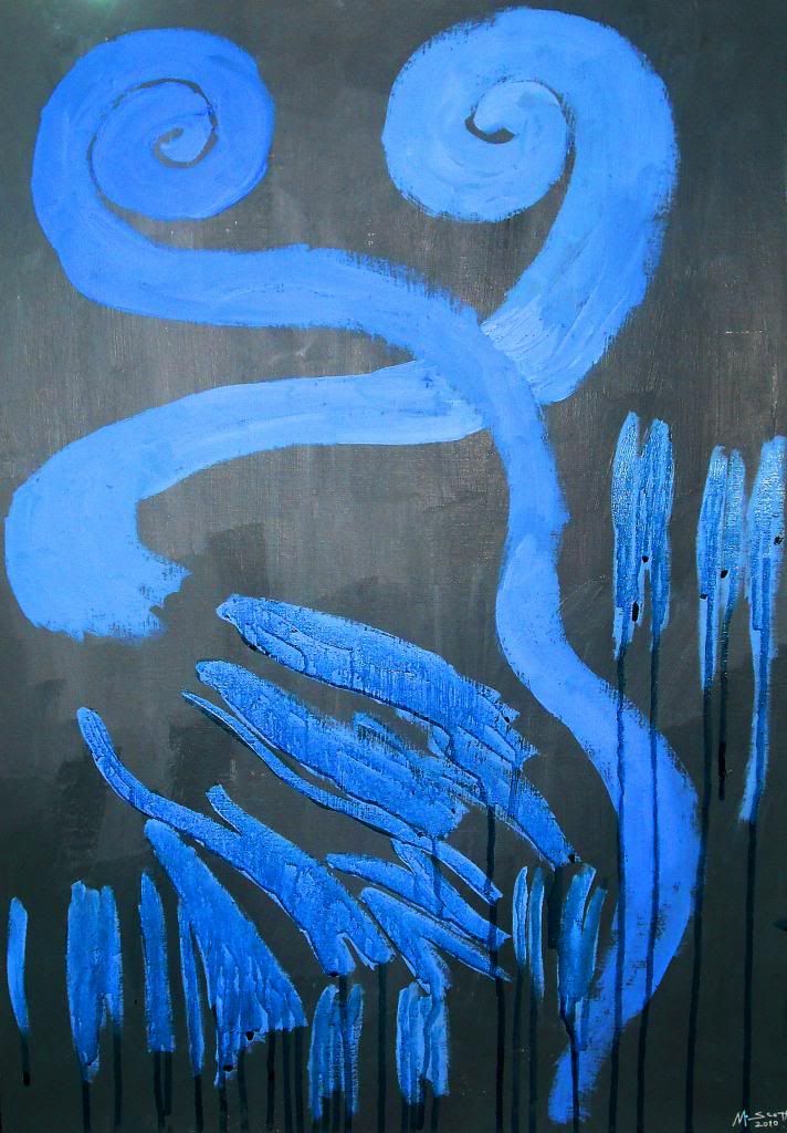
Painting helped expand on the possibilities to how I could express my imagining from the music I listened to, which was always made clear in the titles of my art piece. Although, it is worth considering mixed media responses, incorporating paints with drawing materials. A notable example of this would be Ruska; Apocalyptica, which involved the use of ink. However, I hope to expand onto the use of additional materials.
 
 'Ruska; Apocalyptica' (2010)
 
'Pour Some Sugar on Me; Def Leppard' (2010)
 
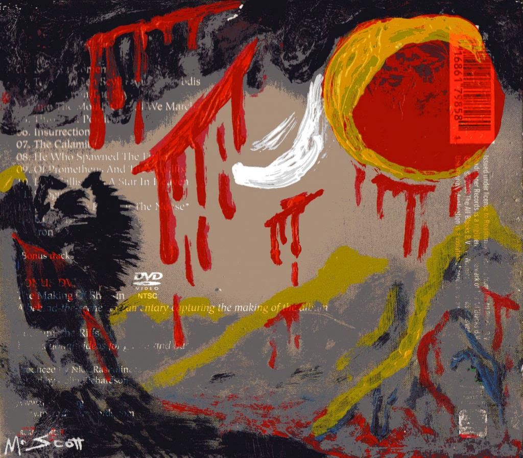
Interestingly enough, Pour Some Sugar on Me; Def Leppard was the only painting I had done on canvas, the previous two were painted on what was called 'canvas pad', which worked more like card but had a canvas-like texture. Major pieces were done on simple A1 sized paper though some I may reattempt on canvas, or at least a more 'exhibit worthy' material. Here are the A1 pieces, presented as closely to the order of their creation as I can recall:
 
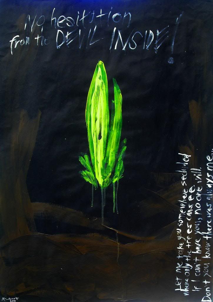
'The Virus of Life; Slipknot' (2010)

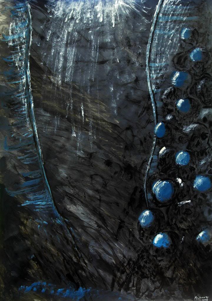
'The Flame; Chimaira' (2010)

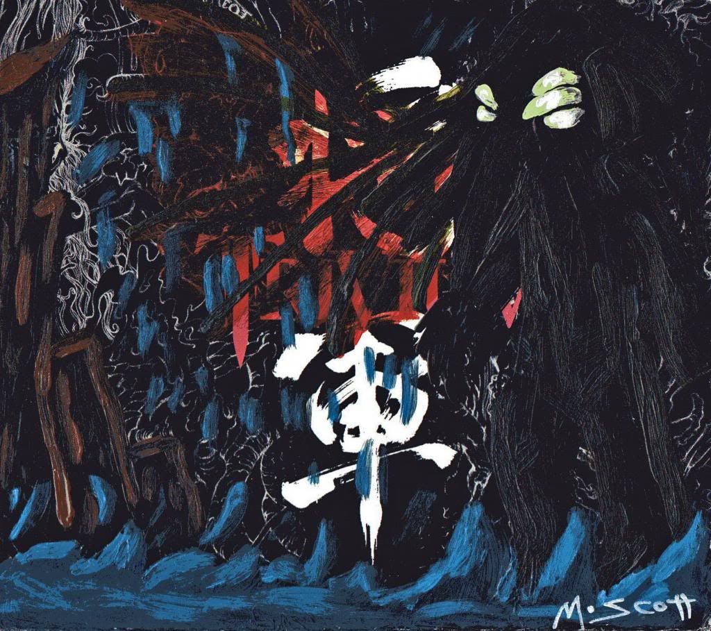
'The Prolonging; Triptykon' (2010)
 
By far, the one I was most pleased with was my response piece to The Prolonging by the metal band 
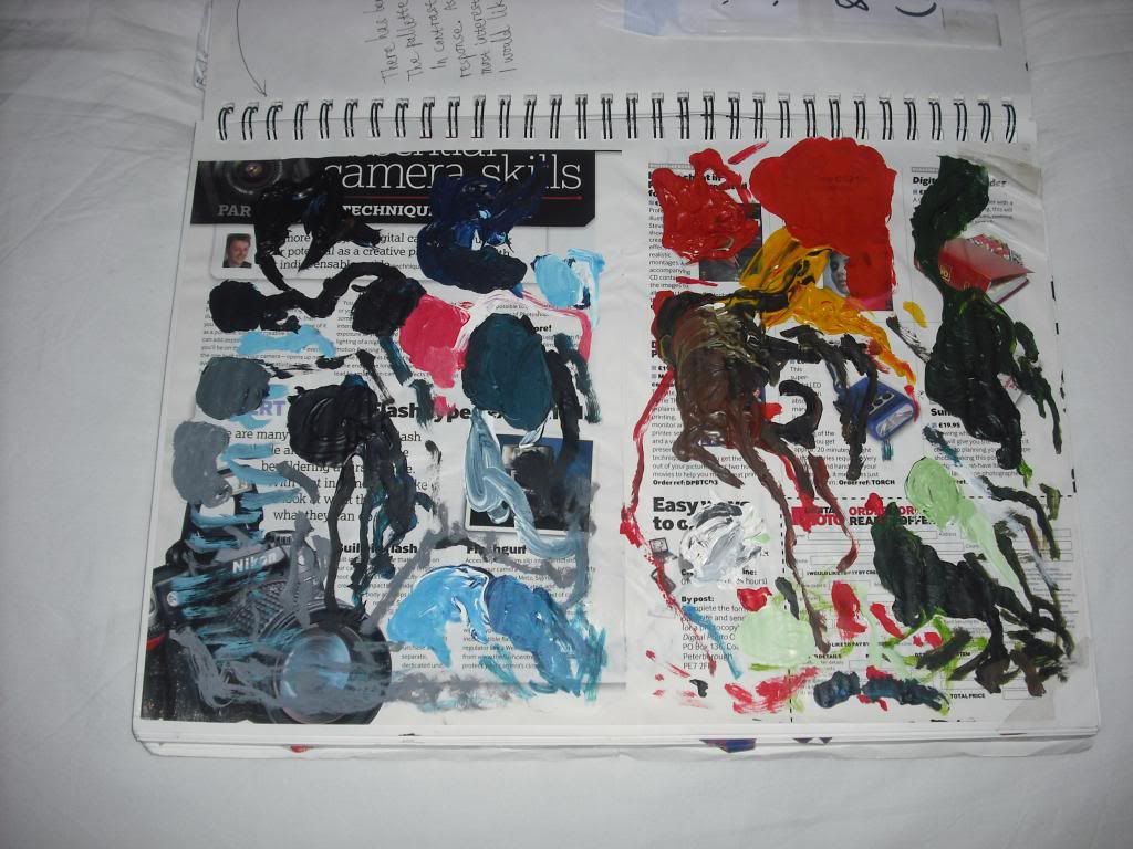
Triptykon. This one certainly has the foreboding, darkly gothic aesthetic I would come to better associate myself with. In some ways, it also works as a piece on its own as a slightly abstract, dark fantasy art piece. Out of the paintings I produced during the project brief, this was certainly one that worked just as well beyond being a response to music which in its own right opens up possibilities to the impact it can have on an individual witnessing the piece. During the project, I also took on some experimentation with potential media. I chose to work, in some instances, on throwaway materials and expand on the outcomes. As a palette, I took an old magazine, opening it up from the centre page and tearing them out after a painting (though I sometimes had one pallette for mulitple, typically related pieces). These 'pallettes' became unitended responses, a in some ways worked closer to my emotional response to the music in comparison to the more landscape-like paintings.


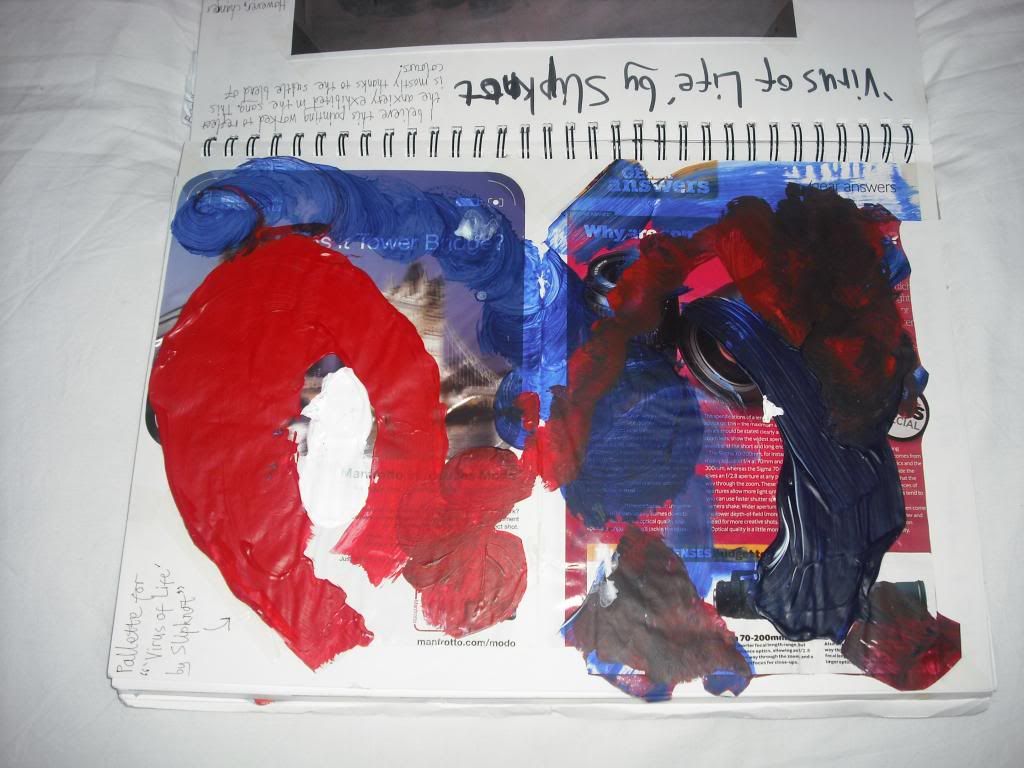
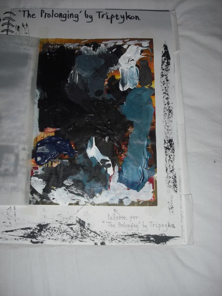
Pallettes for (top to bottom): Hellions on Parade; CKY, The Virus of Life; Slipknot,
The Prolonging; Triptykon and Shogun; Trivium (Triptych)
 
For some of the throwaway materials, I looked at the possibility of painting on scrap wood and metal but also more household objects. For example, End of Time/ Soul on Fire; Danzig was a diptych produced from two old placemats and a triptych was painted from the sleeve of an album (called 'Shogun') by the band Trivium. All songs listened to for the production of the triptych came from the same album the sleeve originally came from. The 'cover' of the triptych was in response to the title track.
 
Side 'A' of 'Shogun; Trivium' (2010)
 
Side 'B' of 'Shogun; Trivium' (2010)
 
There are certainly components of this piece relatable to The Prolonging..., namely in terms of aesthetics.

'Colour & Harmony': Other Workshops - Animation

At the point of starting this workshop, I have almost never attempted animation with only a few crudely produced stop-motion pieces on record. Understandably, I was never expected to have produced a complete animation by the end of the project brief. As an introduction, I was offered the chance to produce a rendered object or figure. For simplicity's sake, I improvised in how I could create a figure from very geometric shapes.
Introducing 'Roy-Bot':


While the this is certainly crude and simple in its construction, it was an enjoyable experience for me alongside the more focused approach in producing my music-based designs. However, I feel my interest, animation-wise, would lie in other media for reasons that became more apparent to myself later on.

Wednesday, 26 September 2012

'Colour & Harmony': Other Workshops - Fashion Design

Alongside painting, the other two workshops I was assigned to were textile (fashion design) and animation. However, because the animation workshop was made to almost exclusively cover digital animation and was something the entire class (me no exception) needed to be initiated in, this was never applied to the project brief directly. Fashion design, however, was more straightforward in putting it to the brief. In fact, it was perhaps approached no differently to how one approached it when painting.

However, very little of what I produced from the workshop remains, little was really made, let alone stood out and anything else was disposed of when I had to clear through some of my artwork in preparations for university. Nevertheless, the only surviving piece(s) from textiles were probably the only contributions worth noting and are also the only reason for this particular post.


Batch 'A' of 'Rites of Spring: Stravinsky'
 
I only listened to two segments from the entire piece while creating a series of collective images. The first six images, Batch 'A', were made to be purely abstract, not representing anything in particular. With the next series of images from Batch 'B', I chose to be make them more illustrative but still relatively ambiguous.


Batch 'B' of 'Rites of Spring; Stravinsky'
 
Although this was certainly an entertaining and fulfilling moment in its own right, I don't see this going any further. Stylistically, it wasn't that different to the previous drawing/painting to music, at that point it was already clear that I could do a lot more using paint. However, that didn't stop me applying drawing materials (graphite, charcoal, etc.) to certain works for mixed media pieces.