Wednesday, 26 September 2012

'Colour & Harmony': Other Workshops - Fashion Design

Alongside painting, the other two workshops I was assigned to were textile (fashion design) and animation. However, because the animation workshop was made to almost exclusively cover digital animation and was something the entire class (me no exception) needed to be initiated in, this was never applied to the project brief directly. Fashion design, however, was more straightforward in putting it to the brief. In fact, it was perhaps approached no differently to how one approached it when painting.

However, very little of what I produced from the workshop remains, little was really made, let alone stood out and anything else was disposed of when I had to clear through some of my artwork in preparations for university. Nevertheless, the only surviving piece(s) from textiles were probably the only contributions worth noting and are also the only reason for this particular post.


Batch 'A' of 'Rites of Spring: Stravinsky'
 
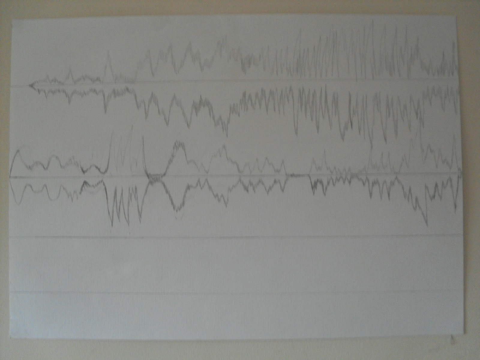
I only listened to two segments from the entire piece while creating a series of collective images. The first six images, Batch 'A', were made to be purely abstract, not representing anything in particular. With the next series of images from Batch 'B', I chose to be make them more illustrative but still relatively ambiguous.


Batch 'B' of 'Rites of Spring; Stravinsky'
 
Although this was certainly an entertaining and fulfilling moment in its own right, I don't see this going any further. Stylistically, it wasn't that different to the previous drawing/painting to music, at that point it was already clear that I could do a lot more using paint. However, that didn't stop me applying drawing materials (graphite, charcoal, etc.) to certain works for mixed media pieces.


'Colour & Harmony': Painting to Music

Painting certainly came across as a straightforward approach to this project brief, especially since it was one of the workshops I was set to take part in. Also, once taking to paint in place of the previous drawing approach, this allowed my responses to the music to become more personal and individual. As an introduction to the idea of painting and music, I was to listen to a number of varied tracks along with the rest of my Foundation Art & Design class. We did also use drawing materials, in fact, prior to actually using paint. Some of the music we listened to once when drawing and again with paints. Others were exclusively while drawing or painting. The following were the results;

 'Die Fantastischen; Krieger (Aphex Twin Baldhu Mix)'


'Sonata no. 3 in C Major; Johann Bach'


'Clapping Music; Steve Reich'
 
 
'First Movement; Steve Reich'
 
 
'Guitar Drag 2000; Christian Marclay'
 
Looking back on this, I say Guitar Drag... still holds up as the strongest piece I produced among the other responses displayed. The conception of the idea very much felt like a 'spark of inspiration'. As the title should have made obvious, it was based on the piece by Christian Marclay called Guitar Drag where he recorded himself pulling along an electric guitar across the ground while connected to its amplifier. Marclay arguably created 'music' while simultaneously causing destruction, which became something of a buzzword leading to the idea of my art piece.
This time, the inaccuracy of the lineart became appropriate as I could also make it inconsistently erratic, further emphasising it track as a destructive piece by cutting into my drawing with a craft knife. Immediately after this, I would begin listening to music of my own selection. I feel this allowed my responses to hold even more personal qualities (though this was not necessarily always the case). I would also, as a result, be given more of an opportunity to take time in producing my responses, allowing me to plan out, even elaborate on a design.

Tuesday, 25 September 2012

'Colour & Harmony': Drawing Sound and 'Soundscapes'

Before actually exploring colour through sound, I attempted to look into form of sound. This was done by drawing what I referred to as 'soundscapes'. Putting a pencil to paper, I drew higher as I felt the music was increasing in volume and/or intensity. In some cases, I tried to isolate different types of instruments and determine their volume and intensity separately. Although the results were inspired by the scientific approach to monitering sound, this was heavily based on just guessing how the sound 'works'.

'Welcome to Gallowmere; Philharmonic Orchestra of the City of Prague'
'Xibir; Dimmu Borgir' (incomplete)

Although it is probably difficult to see how the lines go for the most part on Welcome to Gallowmere..., I attemoted to use the separate 'sounds' to create abstract landscapes. It may be worth re-attempting this, using accurate digital representations.

Friday, 21 September 2012

Third Project Brief: 'Colour & Harmony'

"Analytically speaking, colour and sound are similar to each other. Both have variations in hardness and softness, mood, texture, form as well as degrees of distortion. They may also be arranged to form patterns and on a more personal level, express emotions."

In all likelihood, I may have very well not consistently followed this concept (which I wrote myself). However, this project brief in particular opened me up to new opportunities and helped me developed an awareness of the benefits of aspiring to create art out of my own interests. It was at this point I would eventually decide to focus my artistic pursuits on the subject(s) of Fine Art.

For this brief, I explored the idea of understanding the structure of music (either accompanied with vocals or purely instrumental) and considering the conplimenting colours and possibly forms. This meant I also had to keep an open mind about the properties of colour and sound before applying them to a design.

Colour:
  • Lines
  • Shapes
  • Rhythms
  • Tones (or 'richness' of colour)
  • Pitch
Sound:
  • Texture
  • Beat (use and variety in instruments)
  • Tempo (speed)
  • Mood
  • Vocal
  • Volume
  • Distortion
Most notably, I attempted to understand the personal, emotional impact music had on myself and attempted to recreate it through appropriate, often abstract, use of colours.

Wednesday, 12 September 2012

Overall Conclusion of 'Fauna'

I've been able to look back on this project brief and quite safely say that this was probably thhe worst artistic experience I have had thus far. Though, it is not too surprising that it would happen at such an early phase into my pursuit in the arts. Until shortly before I had taken this Foundation Art & Design course, I had never considered the possibility of looking to the arts as a means to further my academic interests. Even when I took up the course, I initially had no real sense of what I was going to really do; I originally considered illustration though suggestions from my tutor as well as my own personal doubts had me open my mind to the possibility of looking into fine art as a desired subject.

As for the actual workings for the brief, the media I was presented with were not only (to some degree) unfamilar but were also beyond my own actual interest. It's been a shame a notable amount of the inspiration and enthusiasm I could have had was lacking considering the subject matter.

Although, aside the stylised drawing(s) like Japanese Chimera, one other media was revisited but not until university: the lino-cutting. However, it wasn't the prints that could be produced from the lino that became the focus, rather the lino cravings themselves. This will be referred to when relevant.

Overall, the ideas never held on their own compared to anything else I produced, further weakened by a lacking sense of direction. It wasn't until newer, better developed ideas came around that any media revisited from this project brief found a niche in my artistic interests.

Sunday, 9 September 2012

'Fauna': Ink Drawing

Since I was not feeling particularly satisfied with the work I had produced so far, I decided to take some time looking back into a more familiar, illustrative style while experienting with slightly new materials. In this case, I decided to look into producing ink drawings, as inspired by multiple examples presented in these two books I found regarding Japanese artwork.
Taking a simplistic approach to production, I used various photos I had on numerous types of animals (some taken by me, others found on various sites via Google). From these photos, I created chimerical figures by takin the printed photos apart and sticking them together, re-arranging them as desired. From the multiple results made, I select a few (or rather just one) and set out to plan and eventually produce a complete ink drawing using quink ink and a brush.


Circled image was chosen subject for 'Japanese Chimera'
Once a 'chimera' was chosen, I sketched out the body's form and details to key parts of the body and test how the drawings would turn out using the brush and ink.


Sketches and draft images for 'Japanese Chimera'.
The two books referenced earlier helped me to decide on how to stylise the segments as each were based on animals, many of which would have been depicted in the traditional Japanese drawings I looked into. However, in some cases, namely the wings, I had to improvise by looking at depictions of various (often mythical) creatures and through them imagine how the part may have been imagined. From the photo pieces, the wings were meant to be from bats, which I have yet to see referenced from the ink drawings. So instead I looked at a number of drawings featuring demon-like entities and took after their form as a reference.

 'Japanese Chimera' (2010)
This piece is also featured on my DeviantArt account: HypoThermus
 
This was certainly the most enjoyable of the pieces I produced during the Fauna project and it might even be worth exploring this again. I haven't really produced any more drawings similar to this, not until my final project brief from college. Also, as shown from the photo of my sketchbook, I still have other possibilities to explore.

Friday, 7 September 2012

'Fauna': Stencil-Based Patterns

This was originally derived from the print-making workshop, where I scanned stencils I may have potentially used for the prints and then applied them to digital editing. As a result, I produced a quantity of patterns focusing on the outline of a single object. The main front to this was a series of patterns I entitled Assassi-nation.

Original stencil drawing used in 'Assassi-nation' (2010)
The shown image was edited slightly through photoshop and then layered multiple times in different layouts, providing a number of examples to how the piece could be put together. 20 were made altogether but I've only shown a few notable versions. On more than one occasion, I made the patterns all too elaborate to the point the patterns felt aesthetically off-putting.

'Assassi-nation V2' (2010)
 
 'Assaasi-nation V4' (2010)
 
 'Assassi-nation V8' (2010)
 
 'Assassi-nation V11' (2010)
 
'Assassi-nation V17' (2010)
 
However, it wasn't until I tried working with another pattern using a different outline that I felt I made a more effective piece. Entitled 'Flock', I produced an outline based on a kookabura and replicated it multiple times in different colours. The layout of the image was a lot more simplified than the Assassi-nation counterparts but I believe it has also become the most effective through that simplicity.
 
'Flock' (2010) 

Wednesday, 5 September 2012

'Fauna': Print-making

The print-making workshop was generally more focused on printing on textiles however, having printed textiles was not a necessary outcome. Much like my photo-manipulations, I used my own photos as a basis (though any location the copies are unknown to me now).
I chose to look into lino-cutting as a basis to produce prints. From the photos, I traced selected objects within the image to then trace the outline onto the linoleum.


'Oriental Whip Snake Eating a Small Lizard' (2010)
This was originally a tracing used for one of the lino-cuttings. I later chose
to paint underneath the sheet in acrylic, so the outline remained visible.
Lino print of 'Oriental Whip Snake Eating a Small Lizard'.
Originally, I had not taken into account the image being mirrored.
I sometimes took only segements of an image and attempted to re-arrange them over each other to form some vague pattern.

Outline barely came through. I had to re-cut to bring out intended details.
 

I wasn't feeling particularly thrilled when working with these (funnily enough, that was a common feeling for me throughout this project). In hindsight, it was certainly an issue of lacking any real sense of inspiration for what I could work towards rather than actual unfulfilment from the provided media. Especially since now, over a year later, I have found lino-cutting and printing to be most useful in expressing my ideas. Sadly, this won't be shown until much later, when it is more relevant.

 
I used other materials to experiment with for printing, though unlike lino, I would not choose to revisit. Namely, these were wax-based and ink prints. The material was first used to draw out the desired pattern on a sort of paper, which was then placed on top of a sample of fabric to be transferred via steam press. My sample from wax was based on one of the pattern ideas I eventually used for one of the Assassi-nation pieces.
 
Sample wax-based print of 'Assassi-nation V8' (2010)
 

Ink-based prints, images traced from photos taken by myself of animals at Singapore Zoo.

Monday, 3 September 2012

'Fauna': Photomanipulation

Through a workshop referred to as CAD, I was introduced to a few methods of photo mainpulation, which became the main focus of this media. Another very experimental approach to a somewhat new media. I have experienced photo-editing on the level I was working on here before, all with rather lackluster results.  People who chose to specialise in this workshop would produce entire images digitally primarily with programs such as Adobe Illustrator.
Understandably this would appeal to those aiming to persue graphic design. It should be noted at this point, I was still uncertain as to what I would do. However, looking back on this now, I'm not too surprised this workshop did not hold so much appeal to me. In all honesty, even looking back on it now, I feel no different with this project.

'Fizzle Lizzle' (2010)

'Kumudo' (2010)

For samples, I worked on photos I had taken myself at Cotswold Wildlife Park and Singapore Zoo.
I chose to do nothing particularly elaborate, so I just experimented with layering effects.

'Kumudo 2' (2010) 

'Kumudo 3' (2010)
 
It was rather difficult for me to feel invested working with this media so it's more than likely I won't choose to work on anything like this again.