Wednesday, 23 January 2013

'Art Books': Design #2: 'Esquire's Look into Hell'

This one actually developed into the project it became intentionally so. After some deliberate scribbling beside and through the margins of a book entitled Esquire's Book of Gambling, I found myself regularly producing images inside it that, in a somewhat comical sense, were similar to the so-called 'doom paintings' often produced in the European middle-ages. I have had an interest in these sometimes dream-like apocalyptic images for a significant part of my life so far and it certainly hasn't waned. As I continued to work into such images, I began considering the gambling book to become a full-fledged project along with Book of Matches.

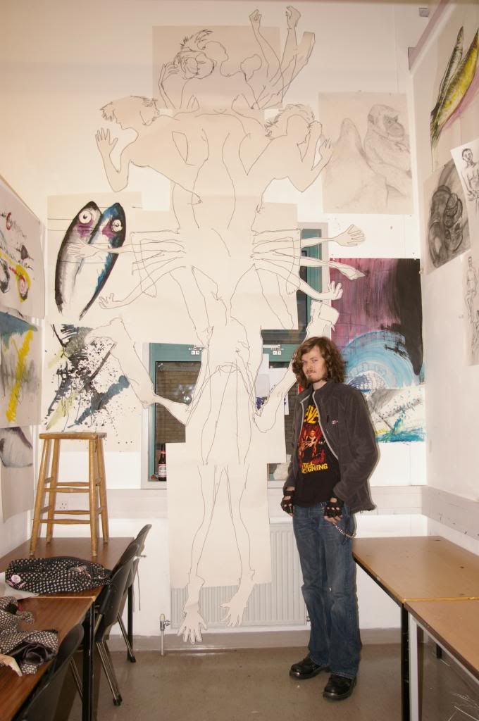
In terms of the book's construction, I set to use the pages primarily as a canvas of sorts to whatever visions I incorporate into the book. Binding feels fairly straight forward, I intend to remove the pages from their original covers entirely and give it new binding and cover that feel more appropriate to the theme consistent to the whole book.


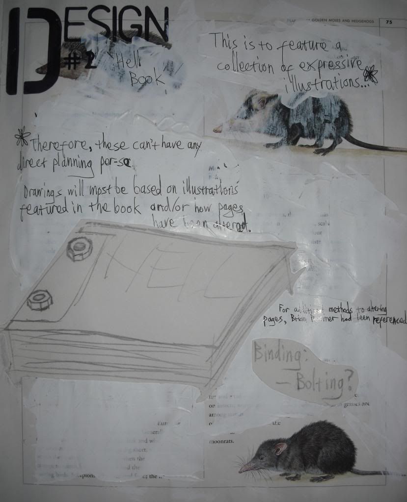
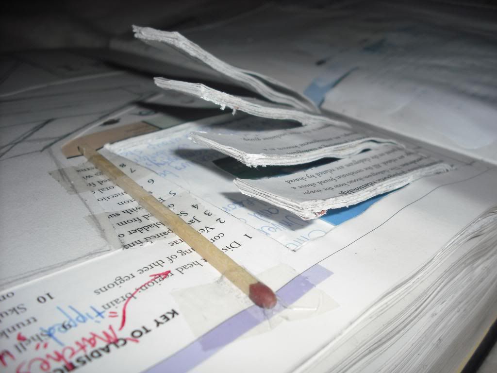
I have considered using a leather cover, or at least a material much like leather. As for the actual binding, I thought of having the pages held together by metal bolts. Since I didn't want to directly bore holes into the original pages themselves, I sought a material to stick onto the page edges, which would have the holes for bolts to go through when arranging it all for a cover.

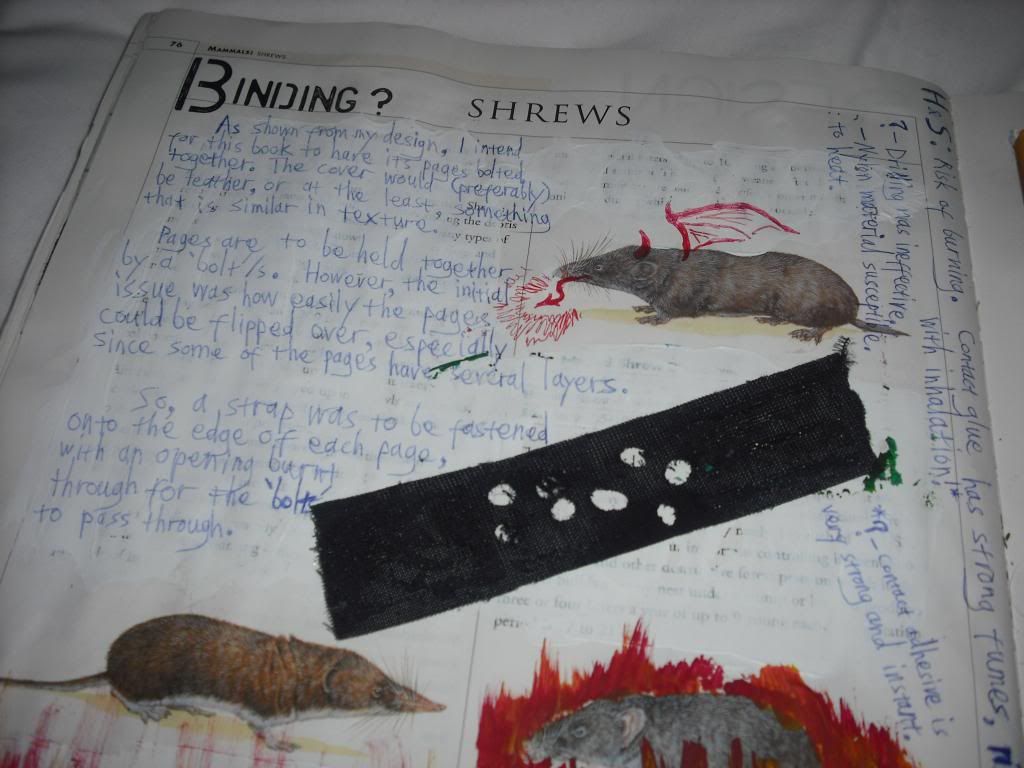
The black strap on the page was the chosen material

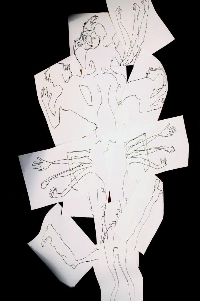
Regarding the actual content I was introducing to the book, I chose to purely focus on images relating to Hell and Purgatory, while occasionally blending the theme with a visually humorous element. For this effect, I looked a little into Insult to Injury by Jake and Dinos Chapman (generally referred to as the Chapman Brothers). Additionally, I decided I needed to refine my visual interpretation of Hell, to present a slightly more narrative style rather than arbitrarily address the mere concept of Hell itself. As an immediate reference, I looked into the Divine Comedy by Dante Alighieri, more specifically the first book, Inferno. To an extent, I would set out to recreate scenes as described by Dante and his ficticious journey into and through Hell, often using the woodcut prints by Gustave Dore and watercolours by William Blake as additonal inspiration.

Friday, 18 January 2013

'Art Books': Constructing 'Book of Matches'

In order to ensure I was prepared with how to construct my piece, Book of Matches, I first settled with working on prototypes towards the final model. I already knew that my 'matches' would be made from cutting pages into columns but I also needed to consider other elements such as arrangement of the matches, building their 'phosphorus' tips, colour and finally how they would be bound as if a book.

As an additional note, we were also required to make note of any concerns for
 health & safety while designing and building the book projects.

Since I had a number of second-hand books in possession, there was relative conveniance with materials for prototypes before having to make the final outcome. I took full advantage by using one of the books to start my first test on deciding how the phosphorus tips of the 'matches'.

Both matches on the far left had mod-roc put on the ends and then
painted in acrylic but in different types of paint.

This prototype also showed me a need to have some distance between each match, especially if they were going to be tipped with mod-roc. Regarding the colour, I decided to settle for brighter, solid colours as I felt it would help the piece appropriate from its Pop Art inspired design.

For my second model, I took out a bound collection of pages from another bookset together a limited number of the total pages available. In other words, there would still be pages left unaltered behind the matchstick pages. I also took this time to work on a method for binding the pages entirely.


Shown words from top to bottom: Hotel, Candle, Burning, Kindle

At this point, the reason itself is now lost from any recollection, I also considered marking out certain letters to create words that have some relation to the chosen subject of the book. In this case, all the words made somehow related to a book of matches, matches themselves and often fire. The binding method used for this prototype also seemed effective enough, requiring the very same materials for the construction of the matches.

Step 1 = Right
Step 2 = Left

Step 1:
"One of the selected books would be split in half, from the binding, after being removed from its covers.
This was done because:
1. More copies could be made from each book.
2. Each book of matches will be at a more appropriate thickness."

Step 2:
"Outline for the matches are drawn on for cutting. The matches are then tipped with mod-roc to represent the phosphorus heads.
Painting:
MATCHES: - Flat colours, as if 'Pop Art' pieces. A vibrant red for phosphorus, the rest in yellow.
BOOK COVERS: - More complex blend of colours to appear like an aged book cover..."
 
One of the volumes of Book of Matches

Tuesday, 15 January 2013

'Art Books': Design #1 'Book of Matches'

Although I bought a number of second-hand books, with the intention that ideas would incidently occur looking through available materials, one idea already developed through a simple thought regarding the wordplay shown in this post's title. It was only from this idea I even asked for and received clarification that the term 'book of matches' was referring to the type of packaging that was originally used for matches in hotels and/or bars.

via Photobucket: source

 
The overall idea for the design also became straightforward. Using pages from a book, I could cut them into columns to be stuck together as if matches inside the 'packaging' which will double as the binding for the book.


A major influence on how the aesthetic elements took shape were based on the works of Claes Oldenburg. Possibly best described as a Pop Art sculptor, Oldenburg most notably took basic everyday objects and took them out of their original practical contexts. Two recognisable series to his works are the minimal but large-scaled sculptures as well as his 'soft' sculptures, collapsable objects constructed from canvas and foam.
 
One of the foremost proponents of Pop art, Claes Oldenburg is credited as the creator of soft sculpture. Throughout the 1960s, he made oversized hamburgers and pieces of cake in vinyl stuffed with kapok, and miniature, collapsible canvas objects such as drum sets, which offer wry commentary on the dominance of fast food and mass culture. Oldenburg’s work marries the Surrealists’ absurdist disregard for scale and functionality with a Pop art fixation on the crassness of consumerism. His objects and sculptures are often issued in editions, thus echoing the mass production of the original items.
- Soft Sculpture, article from National Gallery of Australia (2009)
 
Interestingly enough, Oldenburg had too produced a sculptural piece (Mistos, Match Cover) not too dissimilar to the book of mathes concept I decided to work on. Also, not unlike some of Oldenburg's works, I plan to produce Book of Matches as a voluminal piece. This all too prefectly models itself after his focus on Pop Art and its relationship with items of mass production and consumerism.


Saturday, 12 January 2013

Fifth Project Brief: 'Art Books'

In addition to the other briefs and prior to our Final Major Project (FMP) in Foundation Art & Design, this 'art book' project was set as part of an additional certificate. Admittedly, I don't remember the details on this certificate and hence its relevance to the rest of the Foundation course. As for the actual aims however, we were to produce a minimum of two art books. Both had to focus on a different theme, be 'hand-made' and hand-bound and at least one of them had to be 'free-standing'. The actual definition as to what constituted as a free-standing book was most deliberately left vague. Fortunately, this did mean that the requirements were not too restrictive on possible outcomes and also meant I could aim to make my free-standing book project with an almost sculptural quality.

Even before beginning the project, I knew this would involve at least one of the most explorative pieces I produced for the whole course. I most certainly decided to go all out with using books as a base media to my art to the extent of using a second-hand encyclopedia as my sketchbook, specifically for the project.
To be specific, it was The Marshall Illustrated Encyclopedia of Animals.


This way, I figured I could use the sketchbook as a continual medium for experimentation. I also wanted to take away the elements of producing a sketchbook that can more or less feel like a chore rather than a fulfilling recording of artistic development. Or perhaps a better way to word this would be to say I did it take make the project more fun.


With this in mind, I most certainly plan to make the most out of presenting what I developed through my sketchbook as much as what I've actually built as the final outcome. In a sense, my process/es allowed the sketchbook to become an art piece in its own right, albeit a highly experimental and non-refined one.

Saturday, 5 January 2013

'Body & Form': Conclusion

Ever since I more decidedly focused on producing my works as contributions to fine art, I feel as though I've become a lot more comfortable.

At the time of writing this, I can't remember whether I have alrady mentioned it but I was once asked why I haven't decided to pursue illustration, given my more typical drawing style(s), I stated that I was not comfortable with the idea as it meant I had to train towards creating other people's ideas. In ways, I feel that allowing myself to 'let myself loose' has also better opened up the oppotunity for me to develop ideas that force me to experiment further, in terms of my technical skills especially.

It might not seem like much for some but each of these projects have provided me opportunities to work on new things as I go on. At the same time, I become more aware of what I hold interest in the most and that in time shapes what future projects may become.

Three of the pieces I worked on for the Body & Form project brief: Legion, Casket and Mythologies are all pieces I wish to work on further still and hopefully explore other technical means to express them. Indeed one of them, as you will see, had already begun to work that way.

'Body & Form': 'Legion'

"I am Legion, for we are many."
- Mark 5:9
 

The idea for this was very much a simplistic stroke of inspiration from connecting two key phrases. When I began my first official workshop session for painting, I remember my tutor talking about "tracing" and "connecting". Something drove me to, more or less, do just that. With the help of several other students from college, I traced around different segments and parts of their bodies onto a number of A1 sheets of paper. I had no immediate design for the final form when I started. Rather, I traced for different pieces and then worked on how they could connect to one another. Eventually, this would lead to the development of a slightly refined design. I still wanted enough spontaneity to have taken charge of how the piece formed. When I felt I produced a sufficient number of sheets, I began rearranging them and deciding on which ones I used and rejected as well as which ones would be cut out, based on their outlines.
 
This was the final outline:
 
 
I had also considered a possibility to have the final presented piece coloured. I worked on at least three considered colour schemes (not presented here). The chaotic structure of Legion was to reflect on how, as individuals, we lead different lives, each of them shaped by different experiences which cause us to differ in how we view the world. If done correctly, a collective flow of colours could be used in effect to that idea. However, I felt unsure and considered the possibility that the colours could just as likely distract viewers from the actual form and structure of Legion. Colours can more likely correspond to ideas and thoughts more likely shared among people than experiences, hence I finally decided to let the colourless form amplify its vagueness.